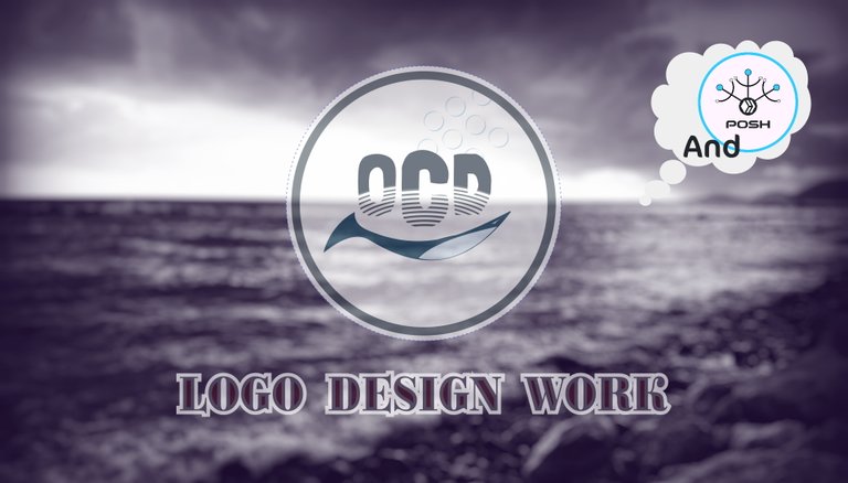
A logo for OCD and POSH - Introducing to my Creations
All Rights Reserved.
All the images contained in this post were created by me. All the contents in this post are copyright-protected. All the uses of the contents - and their derivatives - are strictly prohibited without the explicit consent of the author.
Hello Hive!
About a week ago I read a post by @acidyo where launched a small competition for the creation of a logo for 2 different protagonists of the Hive scene: Ocd and Posh. I invite you to inform yourself in case you don't know much about it, to date they are both excellent projects. Considering my project under development - Digitall Project - I decided to try my hand creating a logo each.
POSH
Posh is a project launched months ago that aims to increase the sharing of articles posted on the Hive blockchain, mainly in 2 ways: sharing content on twitter and on reddit. How it will evolve in the future is up to the official founders to say, but this is enough for current knowledge. It is in fact a tag to be added when sharing a content, an event that is rewarded through different channels (for example a “posh” token or a platform whale upvote in cases of relevant content).
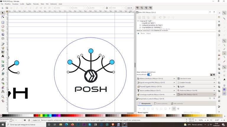
But .... the logo. I didn't have any particular ideas to develop at the time, so I sketched out some possibilities on paper. The principles were based on the concept of sharing, so I immediately identified the shape of a pictogram that represented a kind of amplified circuit starting from a single element.
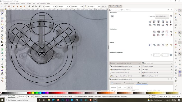
Once that was done, I took my smartphone and photographed the drawing, bringing it to the application I usually use to create graphic designs. I started to draw the basic lines starting from some traces that made the drawing symmetrical. In the photo, you can see the first steps.
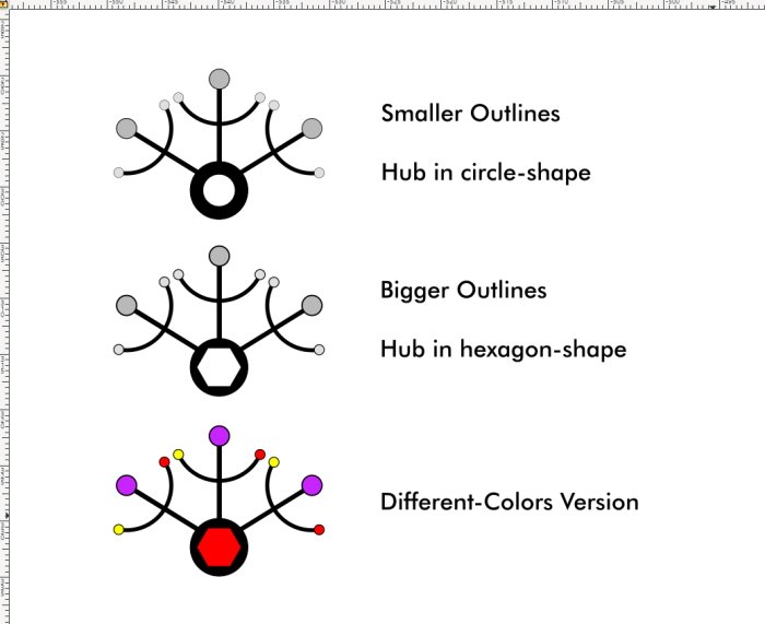
Later, once the digital drawing was finished, I erased the traces. I then created three different variants by changing some details. I have inserted them all in the figure below, describing what the differences are.
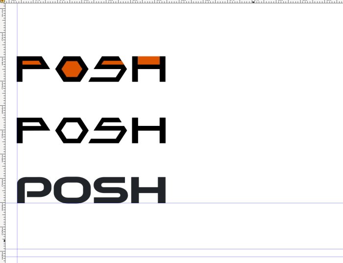
The last step was the creation of an identifying message, the logotype. At first, I created a square one by drawing it from a sans serif. I didn't like the result very much when seen together with the pictogram, so I looked for a font that could tease me. Found it? Well, yes, and here it is along with the other 2 variants previously created.
Defined the choice, I created the complete logo by inserting it in a circle that traces the image present in the profile icons on the interfaces connected to Hive.
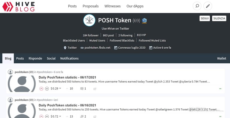
I also created a preview inside a screenshot of the profile page, to understand the final result.
Obviously, any color or shape is purely an initial idea. Details such as colors or outlines can be inserted, faded, deleted or edited. If you like the idea, we will try to embellish it according to the requests of those who will use it. Being a logo in its initial stages, all the appropriate assessments on its possible use (compliance with generalized use on the web or use on a large scale according to current regulations) must be made in case of acceptance.

OCD
OCD is a project that focuses on the curation of new and/or original content published on the Hive blockchain, and other interesting initiatives.
The fundamental idea behind the concept of a logo for ocd is the image of a whale: the concept of a whale in the context of all existing platforms is that of a subject capable of significantly influencing the trend of that platform or the course of events belonging to it. In the specific case of OCD, a subject able to significantly increase the value and the visibility of the posts published on the Hive blockchain.
The other side of the coin is the subject on which the OCD project focuses: the minnows, the subjects whose work does not represent too significant a change for the platform on which they operate.
The decision was simple: I drew 2 drafts on paper and then moved on to the digital drawing.
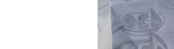
The first referred to the concept of little fish, incorporating a stylized representation of a fish within the OCD writing. You can see in the figure below what I am talking about.
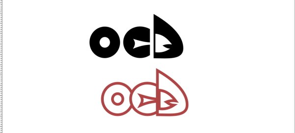
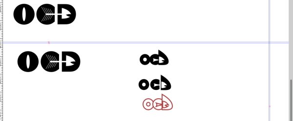
I liked the second one more and, in the end, I chose this one: I created a simple writing element with a font with a not-too-regular outline. I then wanted to recreate a tide effect by applying a particular effect with circular lines at the bottom half of the word, and I combined it all with a pictogram: a stylized whale. I had thought of something softer, with more rounded contours typical of whales. The result I wanted for OCD was something that didn't give too much the idea of the banal, but that gave the idea of a more imposing reputation, an effect that I achieved using sharp angles and not curvilinear vertices as I had initially thought. All this is obviously according to an a priori evaluation, in this case it would be useful to have feedback on what exactly the person requesting the logo wants.
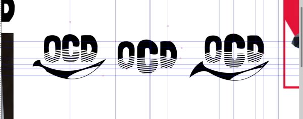
From an initial sketch, I moved on to a small revised version, varying the size of the logo (the word “OCD”) and the contours of the whale.
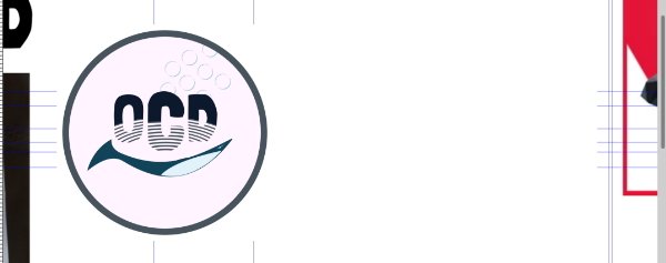
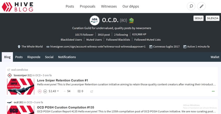
Finally, I placed the logo in a circle and recreated the example of a Hive profile page by inserting it in the space reserved to the profile image.
As in the previous case, colors, shapes, and possibilities of use are factors that will be evaluated if the customer will like the logo.
I hope you enjoyed the post and I leave you a greeting.
To the next time, Hive!
@tipu curate
Upvoted 👌 (Mana: 120/150) Liquid rewards.
Gracias 😁
This is great work, congrats.
At first, I thought that #posh logo is too complicated. Yet, together with the lettering, it functions quite well.
Bravo!
!invest_vote
@ervin-lemark denkt du hast ein Vote durch @investinthefutur verdient!
@ervin-lemark thinks you have earned a vote of @investinthefutur !
Awesome idea. I like that graphics :)
Well, I enjoy. Thank you 😁